Event & Webinar Player
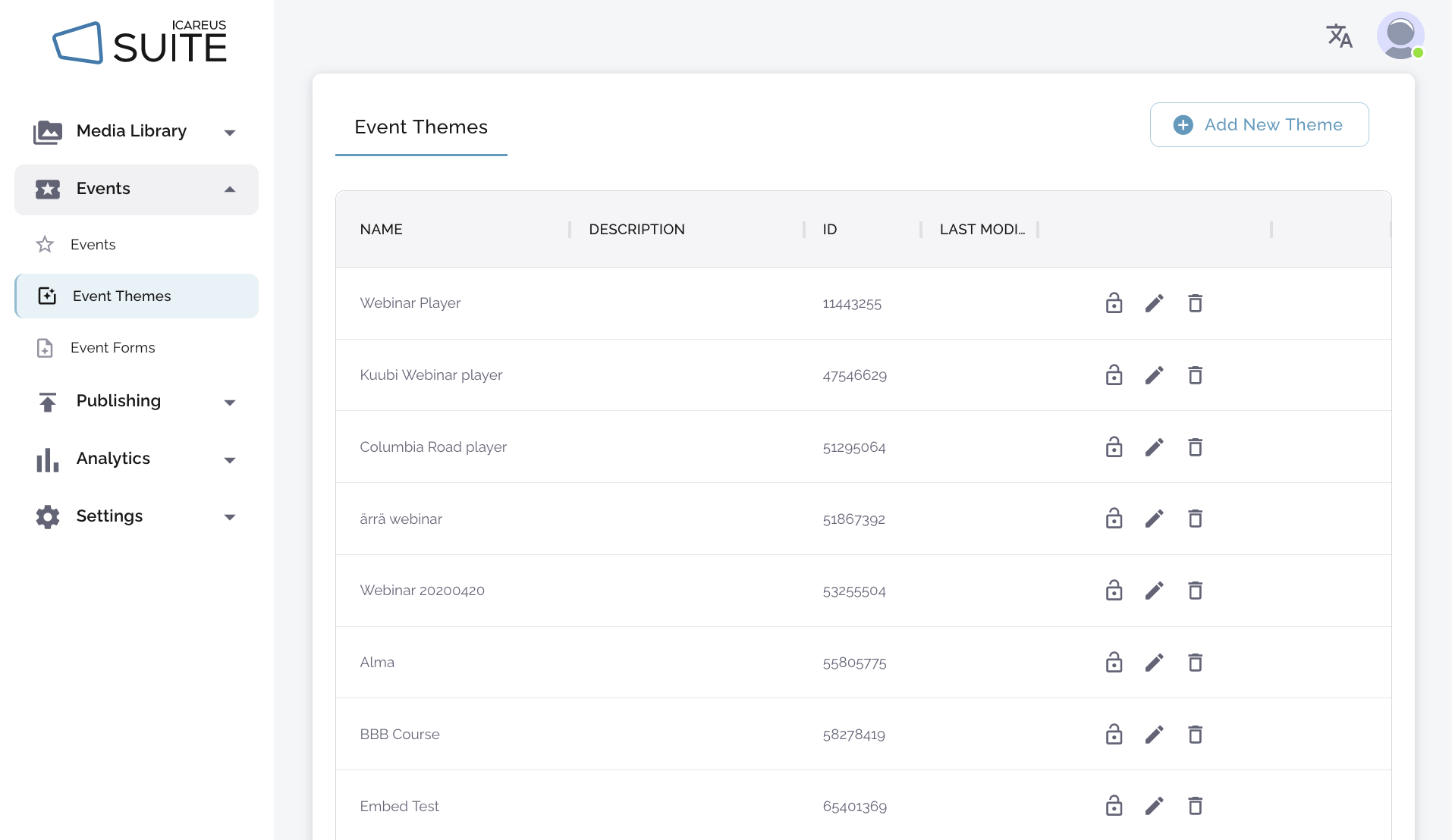
Themes for an event or webinar page are defined under Events -> Event themes. Themes provide a versatile and easy way to customise the look and feel of your event.
Options for customizing an event
There are four options:- Event and webinar player as a separate interface with slides
- Event and webinar player as a separate interface without slides
- Event and webinar player in Icareus' responsive web video portal
1. Event and webinar player as a separate interface with slides
The name of the event is displayed at the top. On the left side, the end user can view a live or recorded view. On the right side, the user can see slides. In the bottom left corner, the user can see the event details. The webinar theme can be embedded on the client's website.2. Event and webinar player as a separate interface without slides
The user sees the video player without the slides. In the bottom corner, the user sees event information. The webinar can be embedded on customer websites.You can also make the player take up all available space by adding the "videomax=true" parameter to the embed URL. In this case, the video player will take up all available space instead of being neatly centered with some space on the sides. To get the most out of the videomax parameter, it is recommended to disable slides and data display in the player settings. In addition to hiding slides and event information, the public header can also be disabled in the event settings. If no additional information is displayed, the player will take up the entire window, so a simple video player can be embedded in the iframe frame of a user's website.
An example of an event player with the videomax=true parameter added to the address and all additional information hidden: https://events.icareus.com/web/ovp-demo/player/embed/event/view?eventId=282766006&videomax=true

Creating a new event/webinar theme
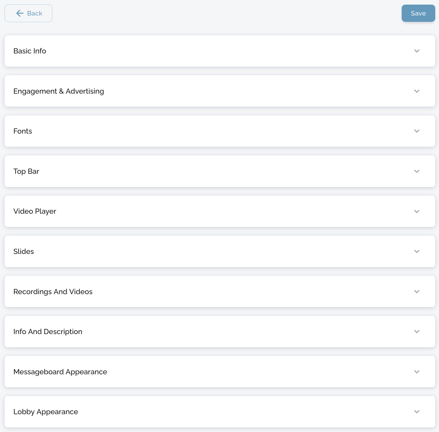
Define the theme/player look and feel
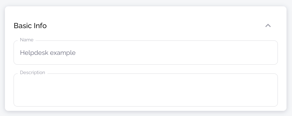
Basic Info
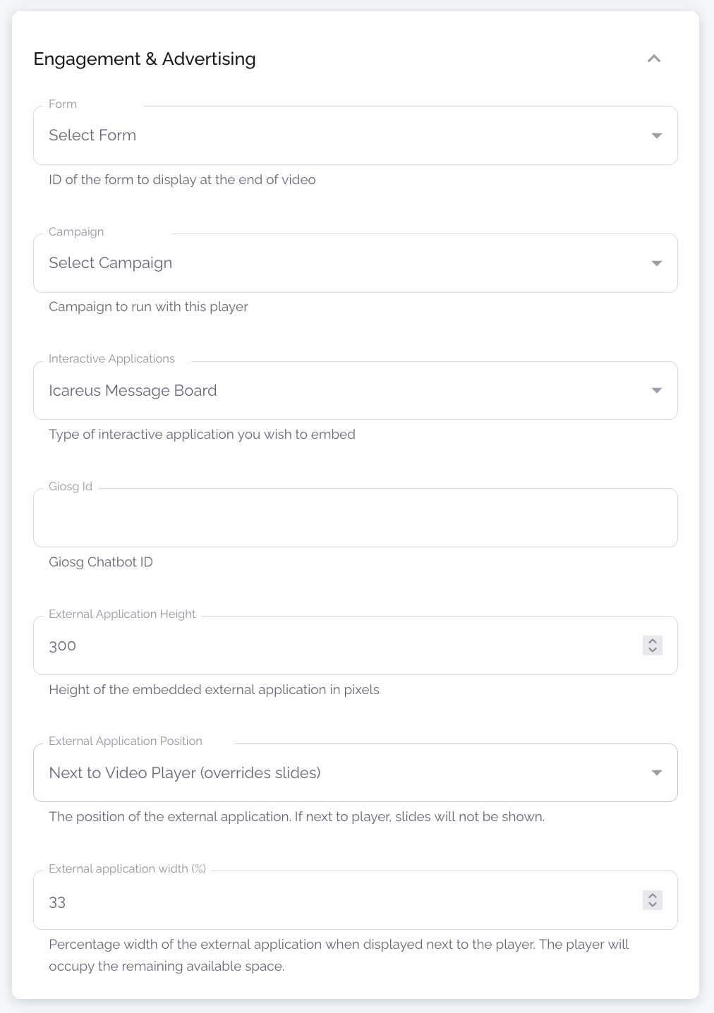
Engagement & Advertising
Fonts
Top Bar
Video Player
Slides
Recording and Videos
Info and Description
Messageboard Appearance
Lobby Appearance
An example of an event player with the videomax=true parameter added to the address and all additional information hidden: https://events.icareus.com/web/ovp-demo/player/embed/event/view?eventId=282766006&videomax=true
3. Event and webinar player in Icareus' responsive web video portal
Event and webinar player as part of Icareus' responsive online video portal - includes links to other videos, live feeds, login, etc. This webinar player is like other standalone players, but with access to other video services. The entire portal can be embedded in the client's website, as shown in the image below.Please note that using this option requires some configuration on the Icareus side to ensure that the layout of the webinar theme matches the layout of the rest of the portal.
Administrators can only customise the webinar theme, but not the look and feel of the portal, which has to be done by Icareus support.
Creating a new event/webinar theme
The look and feel and functions of the webinar theme are customized under Event Themes. To add a new theme:
- Click "Add a theme"
- Define the theme/player layout and settings
- Click "Save"
- Optional: The theme can be edited afterwards from the "Event Themes" list, by clicking on the middle icon to the right of the theme.
Define the theme/player look and feel
The setting options for the player are:
Basic Info
| Name | Type | Description |
Name | Text input | The name of the theme created. Displayed in the list of themes when creating or editing webinar events. |
Description | Text input | Description of the theme created. Displayed in the list of themes when creating or editing themes. |
Engagement & Advertising
| Name | Type | Description |
Form | Dropdown | If you have created a form, here you can choose which form will be displayed with the theme. |
Campaign | Dropdown | If you have created a campaign, here you can choose which campaign to run with this theme. |
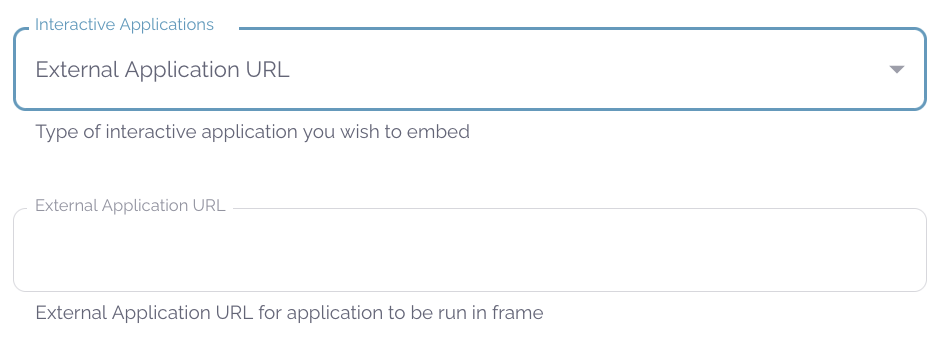
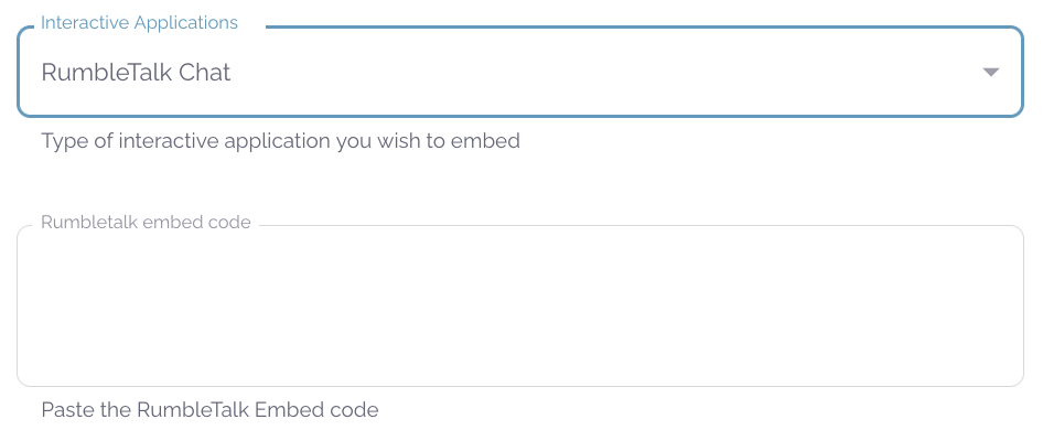
Interactive Applications | Dropdown | The application that is added to the event. If this is left blank, nothing will be added. The other three options are External Application URL, RumbleTalk Chat and Icareus Message Board. |
External Application URL | Dropdown/Text Input | Selecting this option from the drop-down menu will add a new text field to the form. In the field, enter the URL that will be embedded in the player page. Usually used to embed a message board/chat window in the event, but can be used for any embedded content. |
RumbleTalk Chat / RumbleTalk embed code | Dropdown/Text Input | Selecting this option from the drop-down menu will add a new text field to the form. In the field, enter the RumbleTalk embed code. |
Icareus Message Board | Dropdown | If you choose this option from the drop-down menu, Icareus' own chat application will be used. You can customise the chat colours at a later stage in the theme creation process. |
Giosg Chatbot ID | Text Input | If you are using a Giosg chatbot, enter its ID here. |
External Application Height | Value Input | The height of the embedded external application in pixels. |
External Application Position | Dropdown | The external application can be located either below the video area or to the right of the video player, which will override the slides if they are active. |
External Application Width | Value Input | Width of the embedded external application in %. |
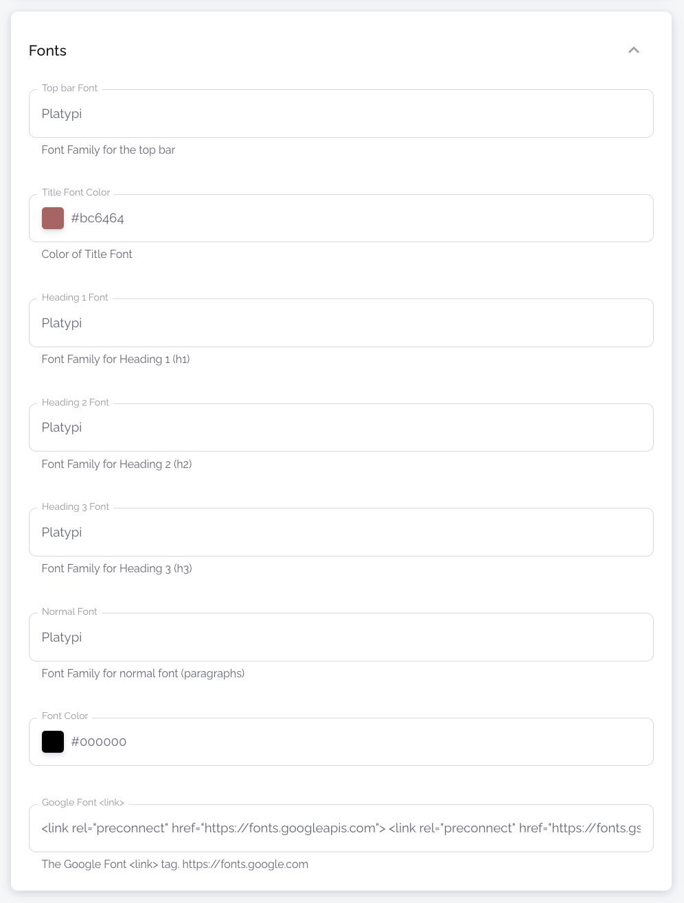
Fonts
| Name | Type | Description |
Top Bar Font | Text Input | Specifies which font is used in the title, description and agenda of the event on the player page. |
Title font colour | Color Input | The colour of the event title on the player page. Also the start time of the event, SoMe buttons and room links if visible will be in this colour. |
Heading 1 Font | Text Input | Heading 1 font name. |
Heading 2 Font | Text Input | Heading 2 font name. |
Heading 3 Font | Text Input | Heading 3 font name. |
Normal Font | Text Input | Body text font name. |
Font Color | Color Input | Body text color on the event page. |
Google Font | Text Input | Add Google font <link>. Adobe fonts also work. |
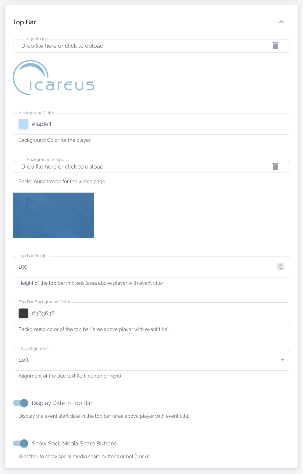
Top Bar
| Name | Type | Description |
Logo Image | File Upload | Add your logo file. This will appear in the top left corner of the embedded event player page next to the event title. We recommend using a .png image with a transparent background. |
Background Color | Color Input | The colour of the player's background. Tip: if you want it to be transparent, type "transparent". |
| Background Image | File Upload | Image in the background of the page. |
Top Bar Height | Value Input | How high the top bar of the page is (in pixels) |
Top Bar Background Color | Color Input | Top bar colour. Tip: if you want it to be transparent, type "transparent". |
Title Alignment | Dropdown | Select the title alignment. |
Display Date in Top Bar | Toggle | If this is selected, the start time of the event will be displayed at the top of the page, to the right of the title. |
Show Social Media Share Buttons | Toggle | If this is selected, social media sharing buttons for Twitter/X, Facebook and LinkedIn will appear in the top right corner of the player page. |
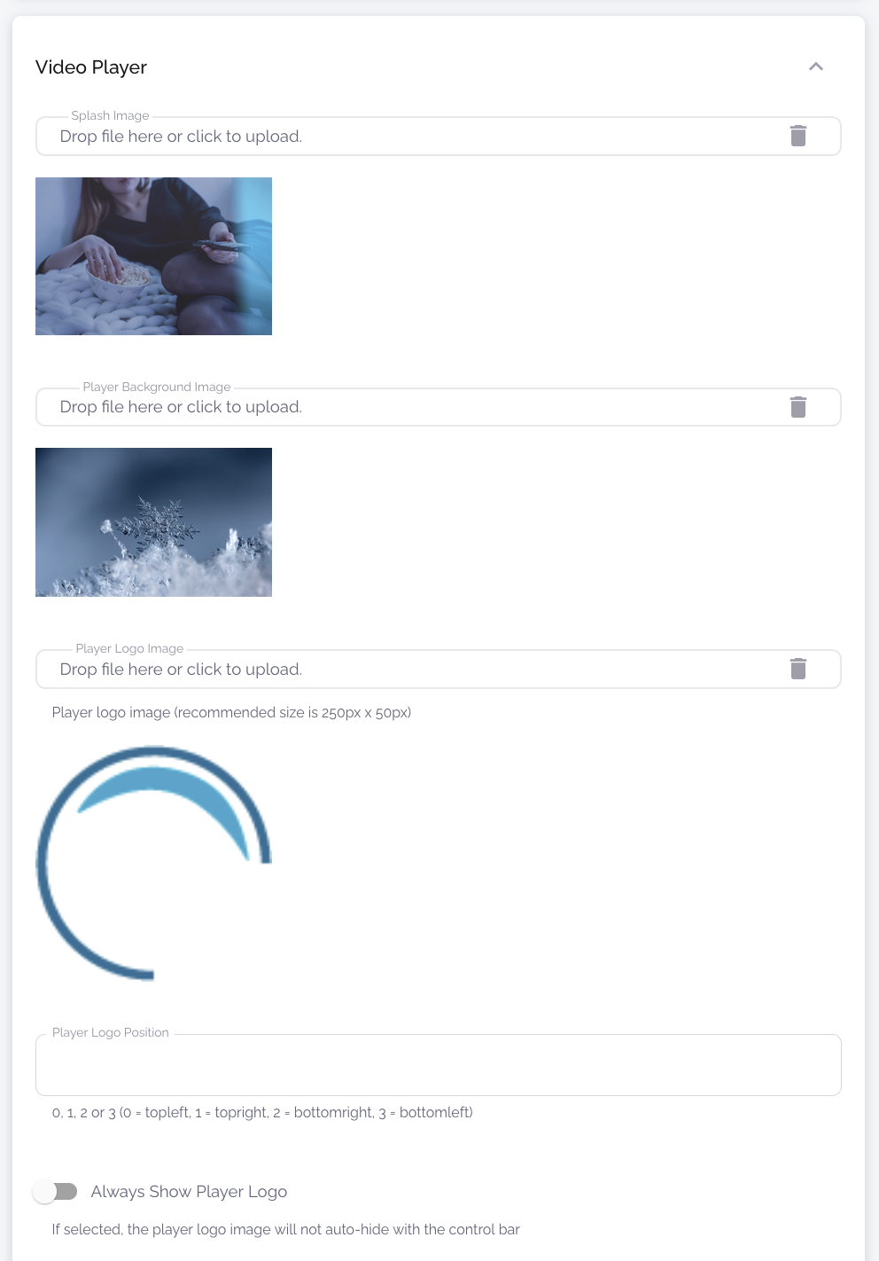
Video Player
| Name | Type | Description |
Splash Image | File Upload | This image is displayed in the event player before the event broadcast loads. |
Player Background Image | File Upload | This image will be displayed in the event player if nothing is sent to the player at that moment. |
Player Logo Image | File Upload | Appears on the video at the selected location. We recommend using a .png image with a transparent background. |
Player Logo Position | Dropdown | The place where the player logo is displayed. By default it's in the top left corner. |
Always Show Player Logo | Toggle | If this option is not selected, the logo will appear when the mouse is over the player and will be hidden after 5 seconds. |
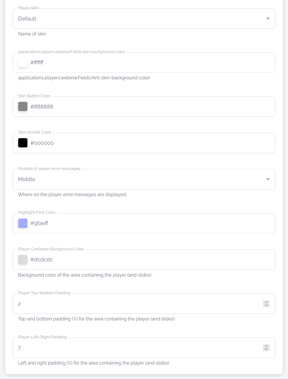
Player Skin | Dropdown | You can choose from four different player skins that change the style of your video player. (See examples below table) |
Skin Background Color | Color Input | Set the background colour of the video player elements. |
Skin Button Color | Color Input | Set the colour of the buttons on the video player. |
Skin Accent Color | Color Input | Set the video player accent colour / button "hover" colour. |
| Position of Player Error Messages | Dropdown | Where on the player the error messages are displayed when they appear. |
Highlight Font Color | Color Input | Colour of highlighted text on the event page |
Player Container Background Color | Color Input | Background colour of the music box. Tip: if you want it to be transparent, type "transparent". |
Player Top/Bottom Padding | Value Input | Empty space above and below the player (% of content box size) |
Player Left/Right Padding | Value Input | Empty space on the right and left side of the player (% of content box size) |
Default | Classic |
Modern | Accessible |
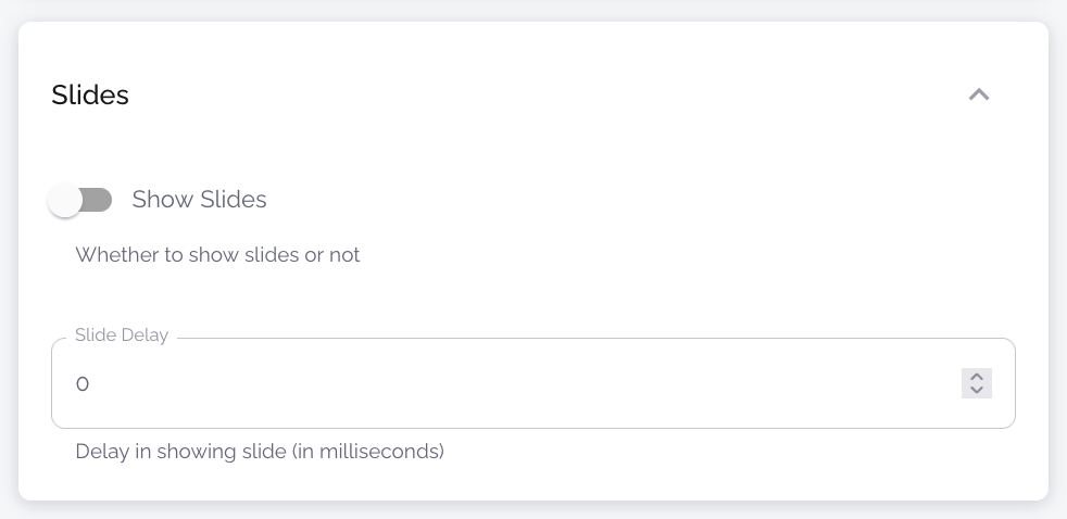
Slides
| Name | Type | Description |
Show slides | Toggle | If this is selected, the slides will be displayed on the right side of the player on the player page. If not selected, the slides will not be displayed and the player will be in the middle (if no external application is added). |
Slide Delay | Value Input | Specifies how long the delay is between when the slide is changed on the "Event Management" page and when the slide is actually changed on the player page. Entered in milliseconds. |
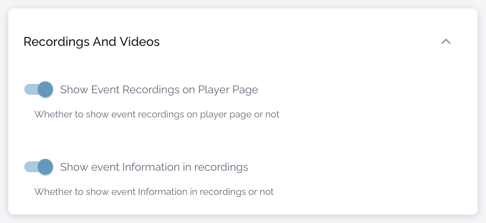
Recording and Videos
| Name | Type | Description |
View event recordings on the player page | Toggle | If this is selected and the event has published recordings, a slider will appear below the video player with thumbnails listing all the recordings available for the event. |
Näytä tapahtumatiedot tallenteissa | Toggle | If the checkbox is selected, a description of the event will be displayed below the video player on the playback page (for recordings and during a live event). |
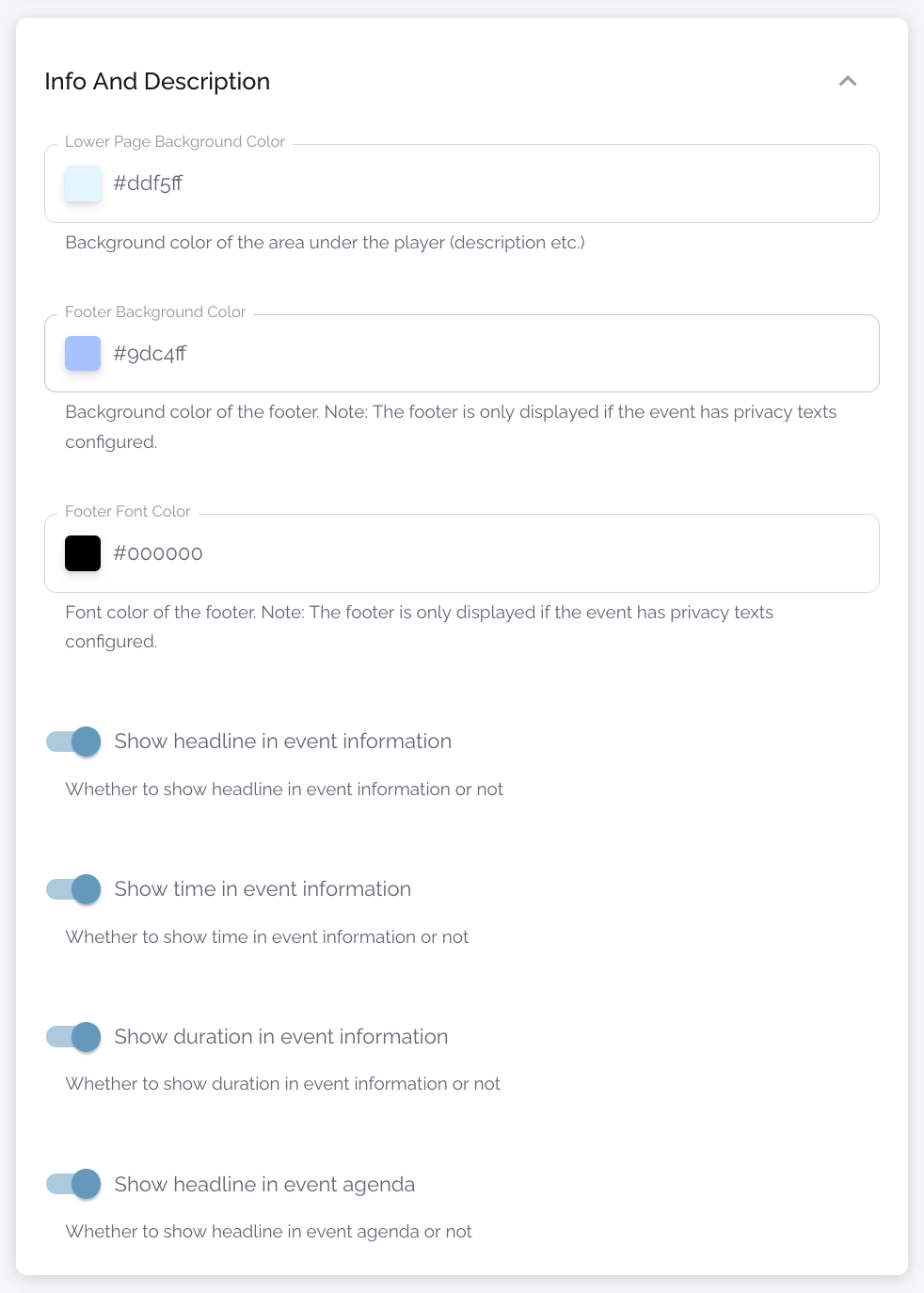
Info and Description
| Name | Type | Description |
Lower Page Background Color | Color Input | The background colour of the lower page. Tip: if you want it to be transparent, type "transparent". |
Footer Background Color | Color Input | The background colour of the footer. Tip: if you want it to be transparent, type "transparent". |
Footer Font Colour | Color Input | The colour of the text in the footer |
Show title in event information | Toggle | If this is selected, the name of the event will be displayed above the description below the video player. |
Show time in the event information | Toggle | If this is selected, the start time of the event will be displayed above the description under the video player. |
Show duration in the event information | Toggle | If this is selected, the duration of the event will be displayed above the description below the video player. |
Show headline in event agenda | Toggle | If this is selected, the title of the event will be displayed at the top of the event agenda when the recording is viewed. |
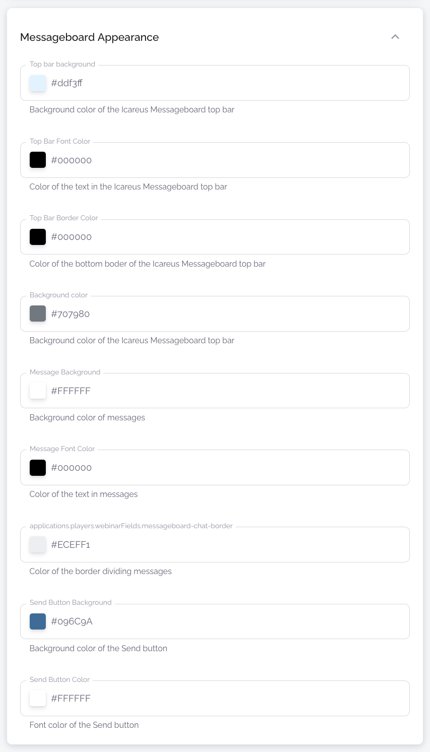
Messageboard Appearance
| Name | Type | Description |
Top Bar Background | Color Input | Background colour of the top bar of the message board. |
Top Bar Font Color | Color Input | Text colour of the top bar of the message board. |
Top Bar Border Color | Color Input | The border colour of the message board top bar. |
Background Color | Color Input | Message board background colour. |
Message Background | Color Input | Background colour of messages in the message board. |
Message Font Color | Color Input | Text colour of the messages in the message board. |
Message Border Color | Color Input | The colour of the border between messages in the message board. |
Send Button Background | Color Input | Background colour of the "Send" button in the message board. |
Send Button Color | Color Input | The colour of the icons on the message board buttons. |
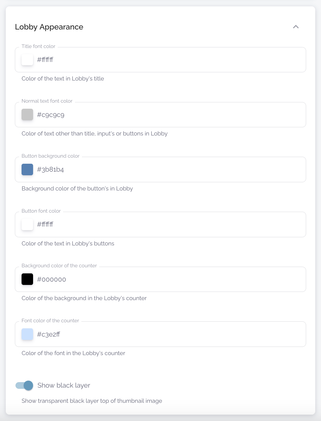
Lobby Appearance
| Name | Type | Description |
Title font colour | Color Input | Colour of the heading text in the event lobby. |
Normal text font color | Color Input | Colour of other texts in the lobby. |
Button background colour | Color Input | Background colour of the buttons in the lobby |
Button font colour | Color Input | Lobby button icons/text colour |
Background colour of the counter | Color Input | Background colour of the countdown in the lobby |
Font colour of the counter | Color Input | Colour of the numbers on the time countdown in the lobby |
Show black layer | Color Input | Apply a layer of translucent black paint over the event image used as wallpaper in the lobby |
Click "Save" --> Your new theme is ready and should soon appear in the theme list. You can create as many themes as you like, e.g. one for each of your customers.
Related Articles
Event & Webinar Player
Introduction The theme of the event or webinar page is configured under Players. Webinar players provide versatile, easy way to customize the look & feel of the video event. Options to use Custom Event & Webinar UX There are four options: Event & ...Introduction to Players
Introduction to Players Icareus Suite offers various video players that can be used and embedded on 3rd party websites. Standard players are based on JWPlayer and Icareus can provide other and customised players as need arises. The player url is ...Event and Webinar Analytics
Introduction Event and Webinar analytics are used mostly by Icareus Video Cloud event customers: enterprises', public organizations', and third sector organizations' event organizers. However, it can also be used for different pay-per-view event ...Download: Icareus Event & Webinar Solution Quick Manual
Download the quick manual to Icareus Event and Webinar Solution: https://icareus.com/download/icareus-event-and-webinar-solutions-quick-manual/Event and Webinar UX Template Functions
Introduction Icareus Event and Webinar solution provides easy tools to anybody to configure both the functions of the Event and Webinar player. The main fuctions are: Video Player Optional: Slides and slides control Optional: Message / Chat / Poll or ...