Creating & Managing On-Demand Video Players
Creating a Player
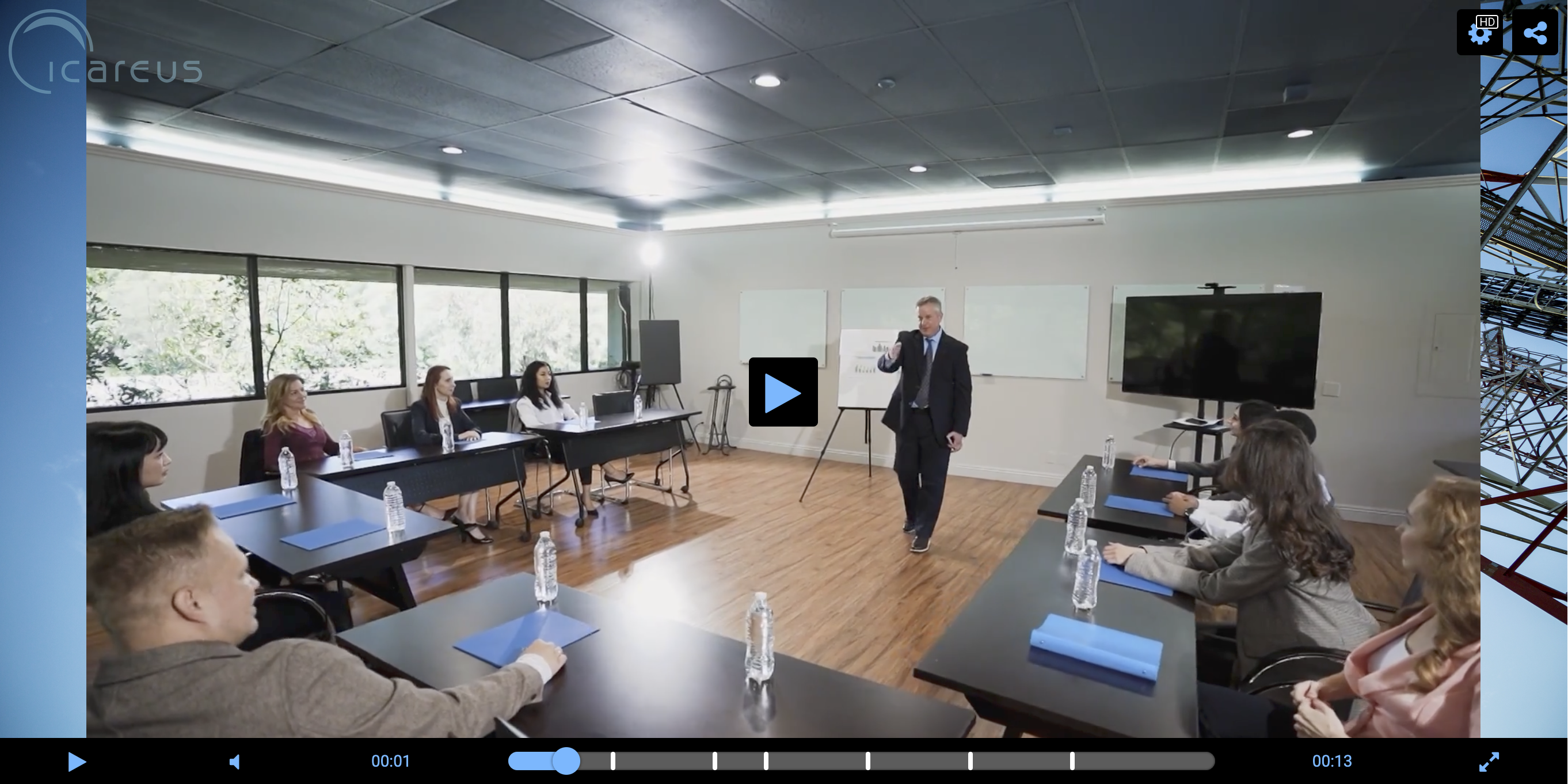
On-demand video players can be created under Publishing -> Players -> by clicking "Add New Player".
It will open the player settings page. Most visual changes can be previewed on the preview video player on the right side of the page.
Defining The Player's Settings
The setting options for the player are:
Basic Info
| Name | Type | Description |
Name | Text input | The name of the player created. Displayed in the list of players when creating or editing players. |
Description | Text input | Description of the player created. Displayed in the list of players when creating or editing players. |
Engagement & Advertising
| Name | Type | Description |
Form | Dropdown | If you have created a form, here you can choose which form will be displayed with the player. |
Advertising activated | Toggle | If active and if you have created an advertising campaign, the ads configured for it will appear in the video. |
Display social media share options | Toggle | If active, a button will appear (in the top right corner of the player) that will let the user copy the video URL and share the video on Facebook, X/Twitter and LinkdIn. |
Dimensions
| Name | Type | Description |
| Video Aspect Ratio | Dropdown | You can pick the video player's aspect ratio. There are four options: Auto, 16:9, 4:3 and 2:1. Auto is the default, and uses the video's own aspect ratio. Images and more info below. |
| Container Width | Value Input | Set the video player container width in % of the page/container it is in. By default it is 70%, so the container width will be 70% of the video page. |
| Player Width | Value Input | The width of the player (in pixels). By default, the player will cover the full area of its container. |
Video aspect ratio options:

These settings only apply to the player when not in full screen mode.
If you pick any other than Auto and the video uses a different aspect ratio, the sides of the video will have empty space. If you've set a Player Background Image (in Skin), it will cover the gaps. Otherwise, the default player background will be shown.
2:1 Player:
Player Background Image:
Logo
| Name | Type | Description |
| Logo Image | Image Upload | The image shown over the video, in one of the corners. We recommend using a .png image with a transparent background. |
| Player Logo Target URL | Text Input | If an URL is pasted here, clicking the player logo will open a tab to that URL. |
| Player Logo Position | Dropdown | The position of the player logo, one of its four corners. |
Always show player logo | Toggle | If not active, the logo will only be visible when the cursor is hovered over the player / the player UI is being interacted with. If active, the logo is always visible. |
Skin
| Name | Type | Description |
| Skin | Dropdown | The player skin/style used. The default is S1, other options are S2, Outstream and TV (Images below). |
| Skin Background Color | Color Picker | The base color of the player UI. |
| Skin Button Color | Color Picker | The color of the buttons when not hovered over/selected, the text and the other non-background elements. |
Skin Accent Color | Color Picker | The color of the buttons when hovered over. |
Player Background Image | Image Upload | The image shown when the video hasn't loaded in the player yet, or if the video has a different aspect ratio than the player. If nothing is uploaded, the default Icareus background image is shown. |
Container
| Name | Type | Description |
| Container Background Image | Dropdown | The image shown behind the video player, covers the video container (More in Dimensions) |
| Border Color | Value Input | Color of the border around the video player. Black (#000000) by default. |
| Border Width | Value Input | The width/thickness of the player border in pixels. |
Example (with the settings of above image):
Analytics
| Name | Type | Description |
| Allow analytics cookies | Toggle | If active, will store viewer device ids in cookies. |
| Send analytics | Toggle | If active, will send video viewing analytics to our system. You can find these video or page specific analytics from the menu, under Analytics. |
Playback Options
| Name | Type | Description |
| Automatically start playback | Toggle | If active, the video will start playing as soon as the player loads. |
| Show speed settings | Toggle | If active, a button will appear (in the top right corner of the player) that will let the user change the playing speed of the video, from x0.25 to x2 speed. |
Creating The Player
When you're done with the settings, remember to save them by clicking the Save button under the preview player. Doing so will add the images you've uploaded (eg. logo, background) to the preview, in addition to saving the player settings and adding the player to the player list.
Returning to the player list, you can now find the new player on it.
List actions
Every player has a few action buttons to their right:
- Lock/Unlock. Locked players can't be edited or deleted.
- Preview. Opens the player (and a demo video) on a modal. To be implemented
- Edit. Opens the player settings page.
- Delete. Delete the player.
Related Articles
Introduction to Players
Introduction to Players Icareus Suite offers various video players that can be used and embedded on 3rd party websites. Standard players are based on JWPlayer and Icareus can provide other and customised players as need arises. The player url is ...Video-On-Demand Analytics
Introduction In contrast to the analytics of live streams and events, real-time is not as important in the analytics of streaming or on-demand videos. It can be used in OVP, OTT and Event uses cases, but also with HbbTV and Smart TV environments when ...Managing Subscribers
Introduction Subscribers are the end users of Icareus Suite service. With OPTIONAL Subscriber module you can restrict and deepen to relationship with your video service viewers, required especially if: You want to charge the viewers for the content ...Clipping a video
Introduction You can clip a video directly in the cloud environment. Clipping means cutting footage from the video into separate video assets. Clipping To open the clipping tool, click the "Clip video" icon next to the video preview on the video ...On-demand Player
Managing VIDEO-ON-DEMAND PLAYER On demand video player is used to play videos which have been uploaded into Icareus Cloud using 'Assets' menu item on the left. VIDEO PLAYER URL Each Account on Icareus Suite has its own URL for on-demand player. It ...